
ACDC
Magazine
For this typography project, the goal was to create a magazine publication consisting of a wordmark, a cover, a table of contents, and two articles. I chose to create a magazine called “ACDC,” which showcases queer musical talent in the indie rock scene.
Statement
ACDC is an enthusiastic showcase of queer musical talent that breaks boundaries in the bold world of indie rock.
Words I did and didn’t want the publication to reflect:

Electric
Loud
Spirited
Diverse
Free
Fluid
Authentic
Intersectional
Bold
Divergent
DIY
Passionate

Quiet
Fancy
Perfect
Dull
Conforming
Undaring
Commercial
Traditional
Small
Rigid
Wordmark
Goal
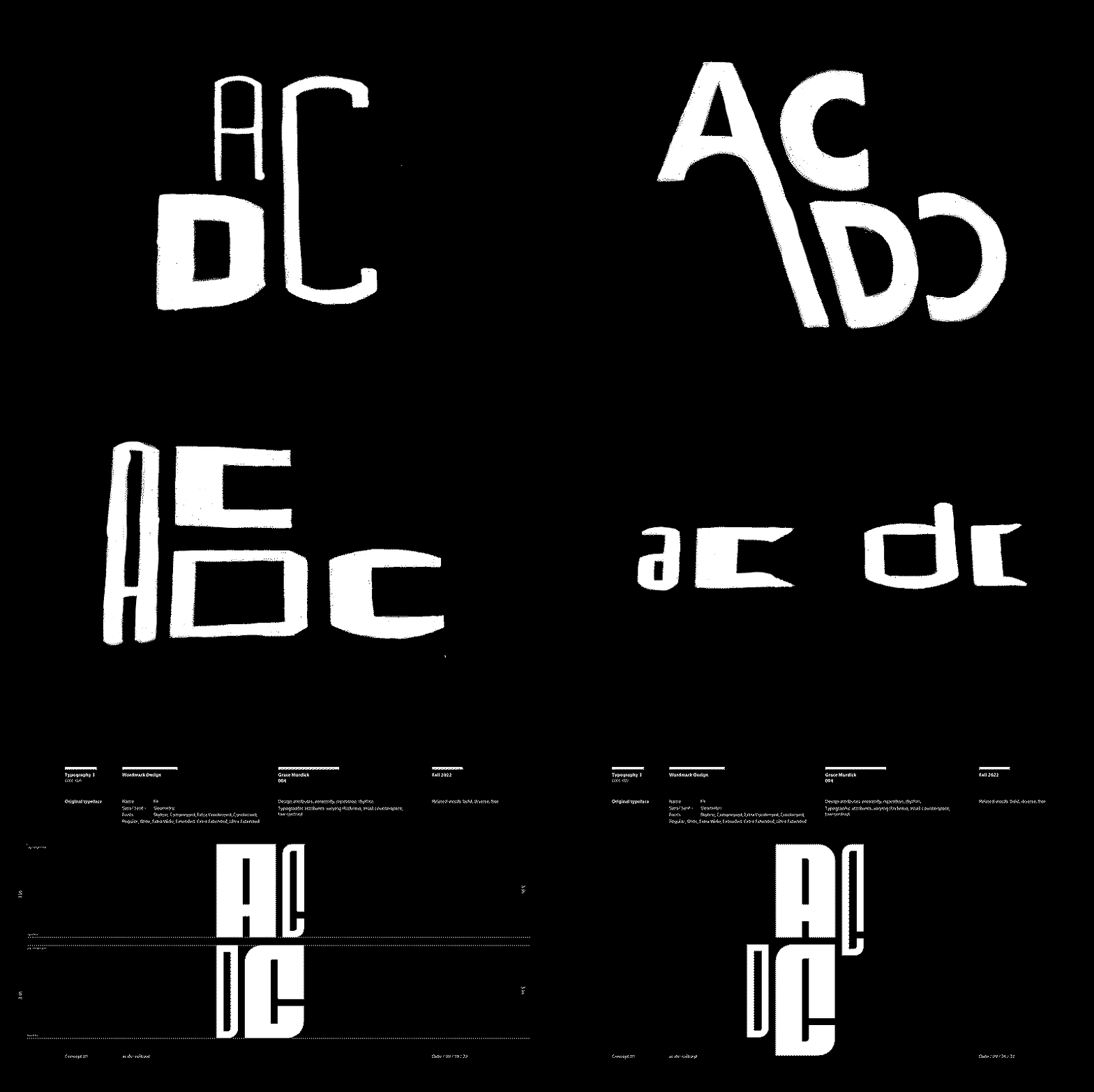
To reflect the rhythm that indie rock music has, while also making the wordmark capture the idea of how queer indie artists break backgrounds.
Sketches

Iterations

Typeface Choices
FIT
![]()

Process GIF
Final

Spreads
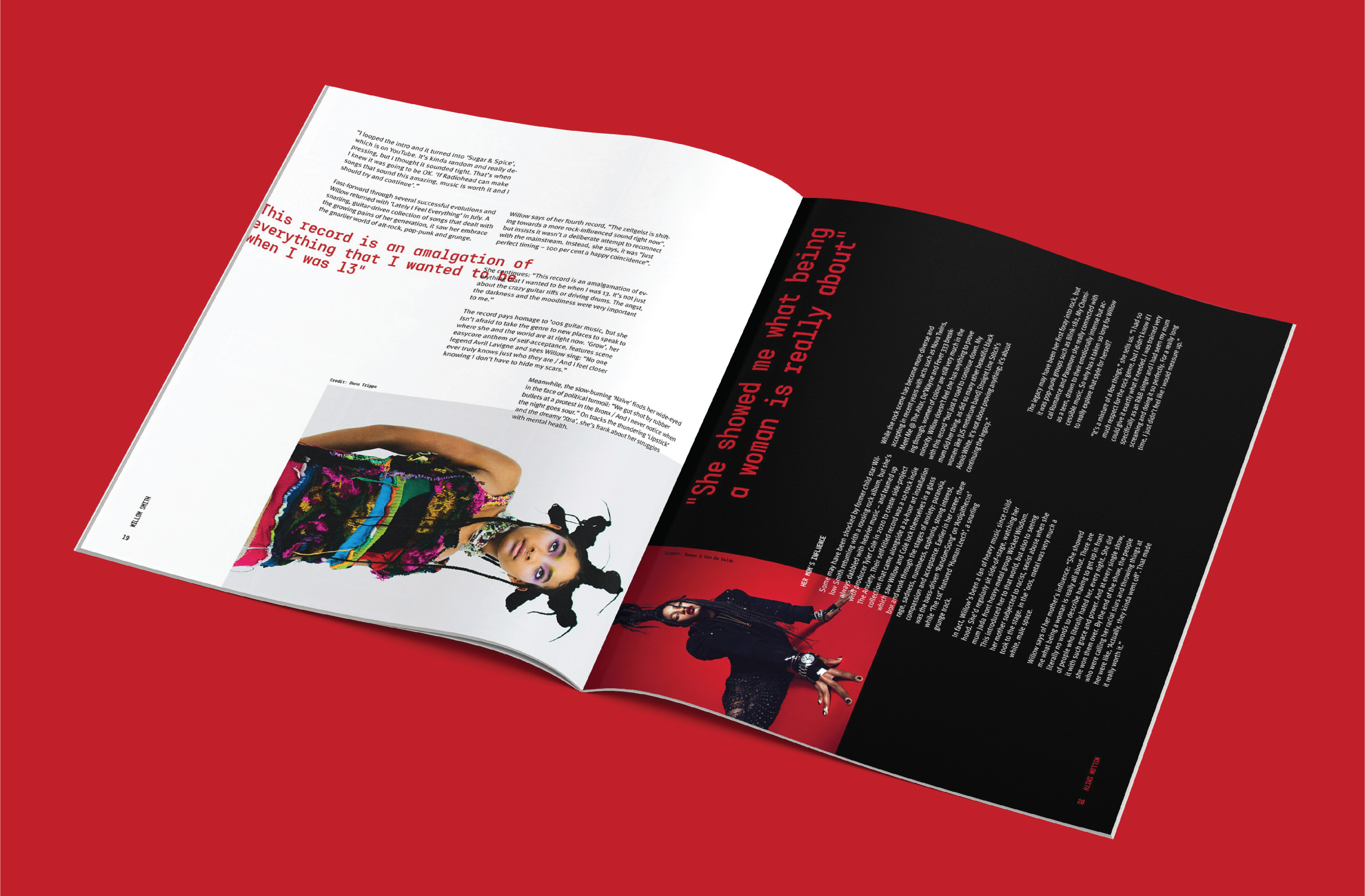
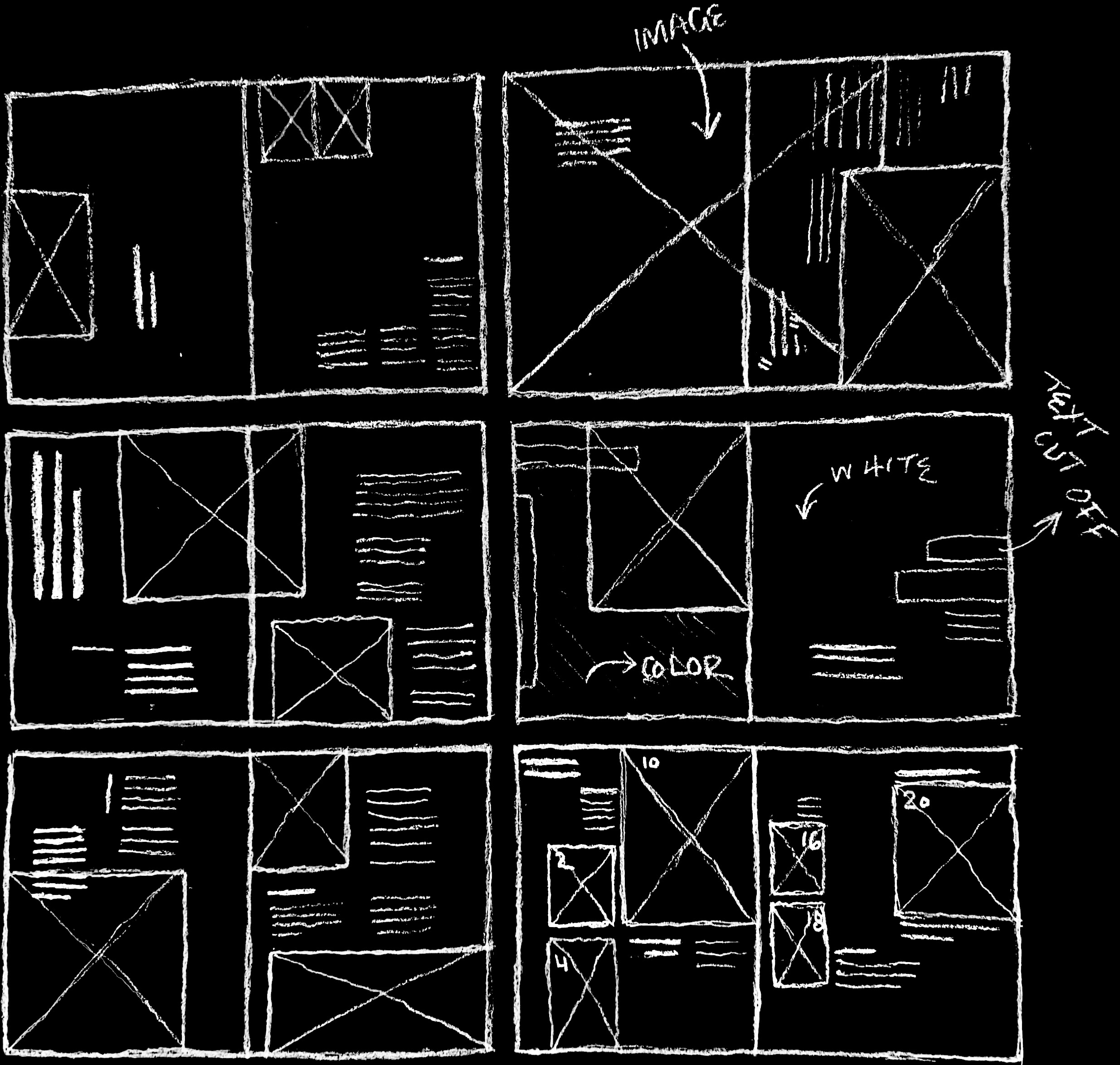
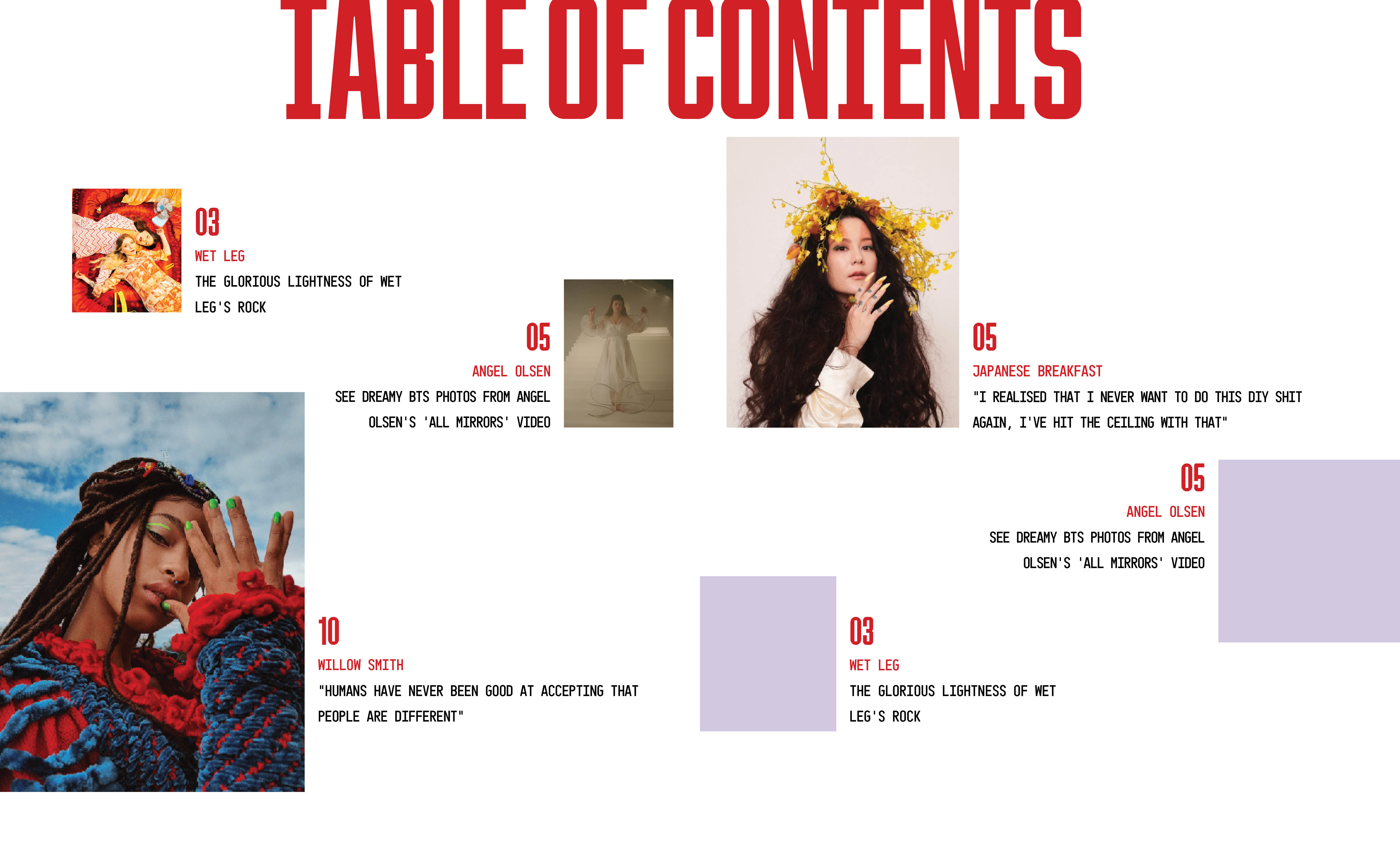
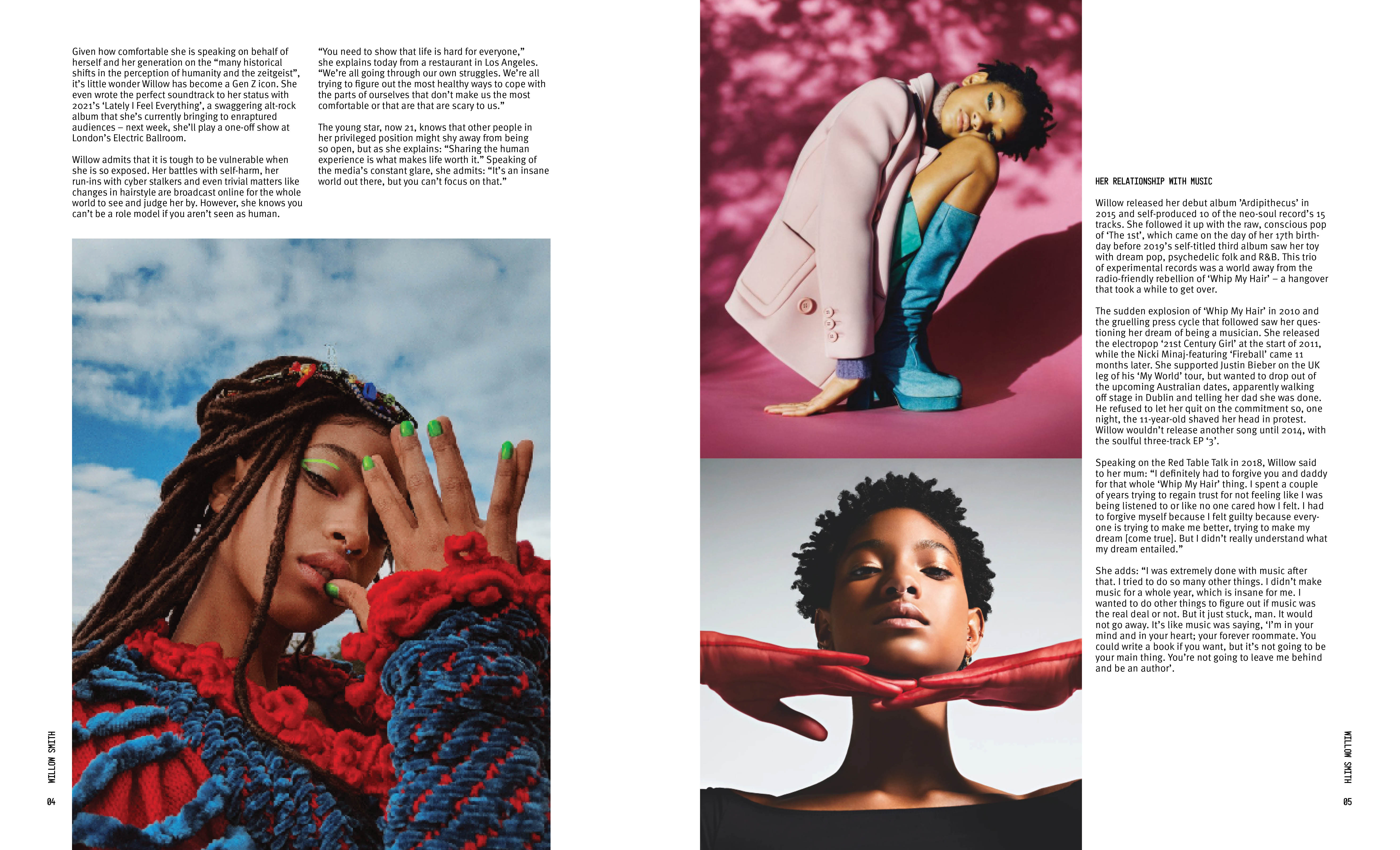
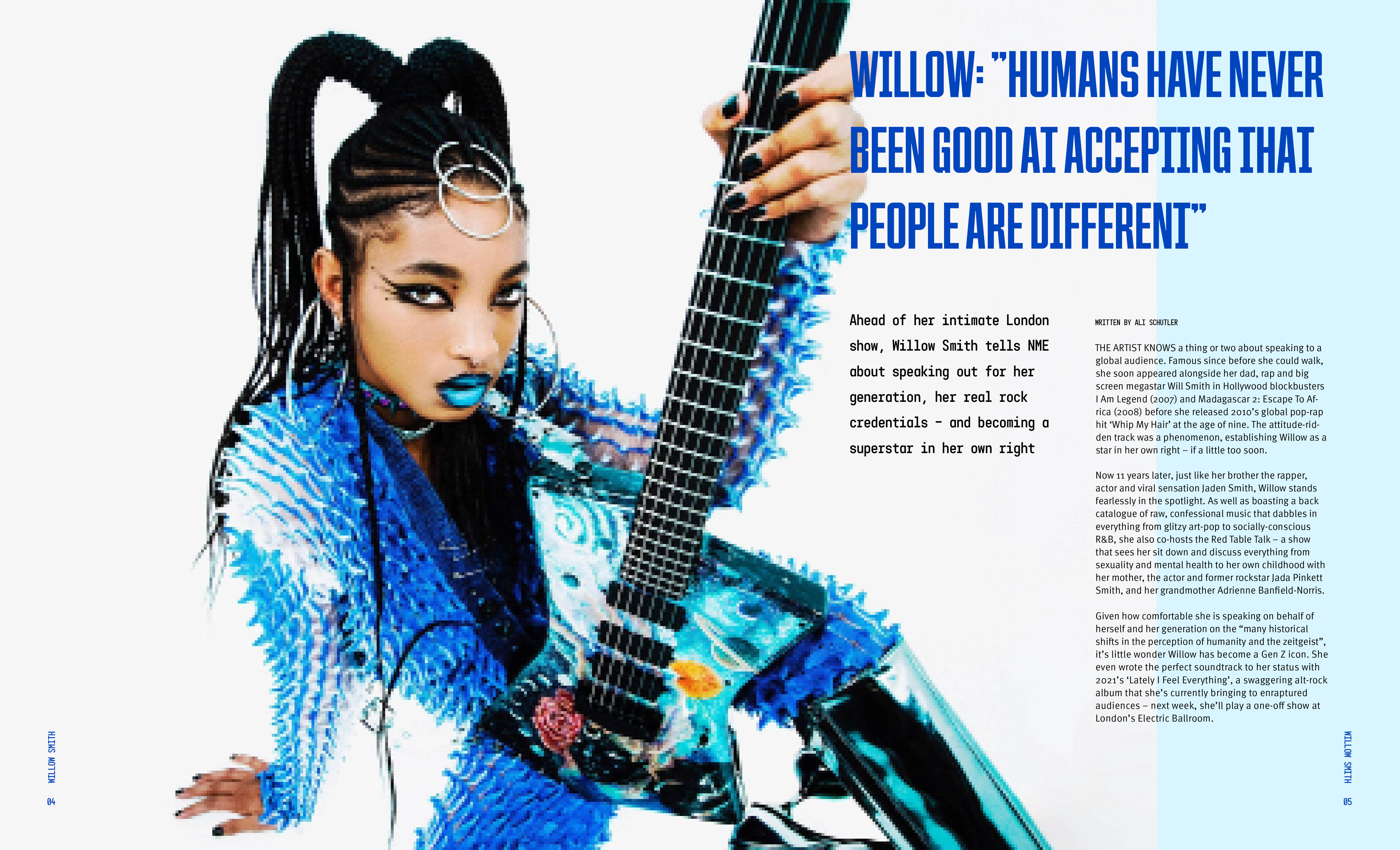
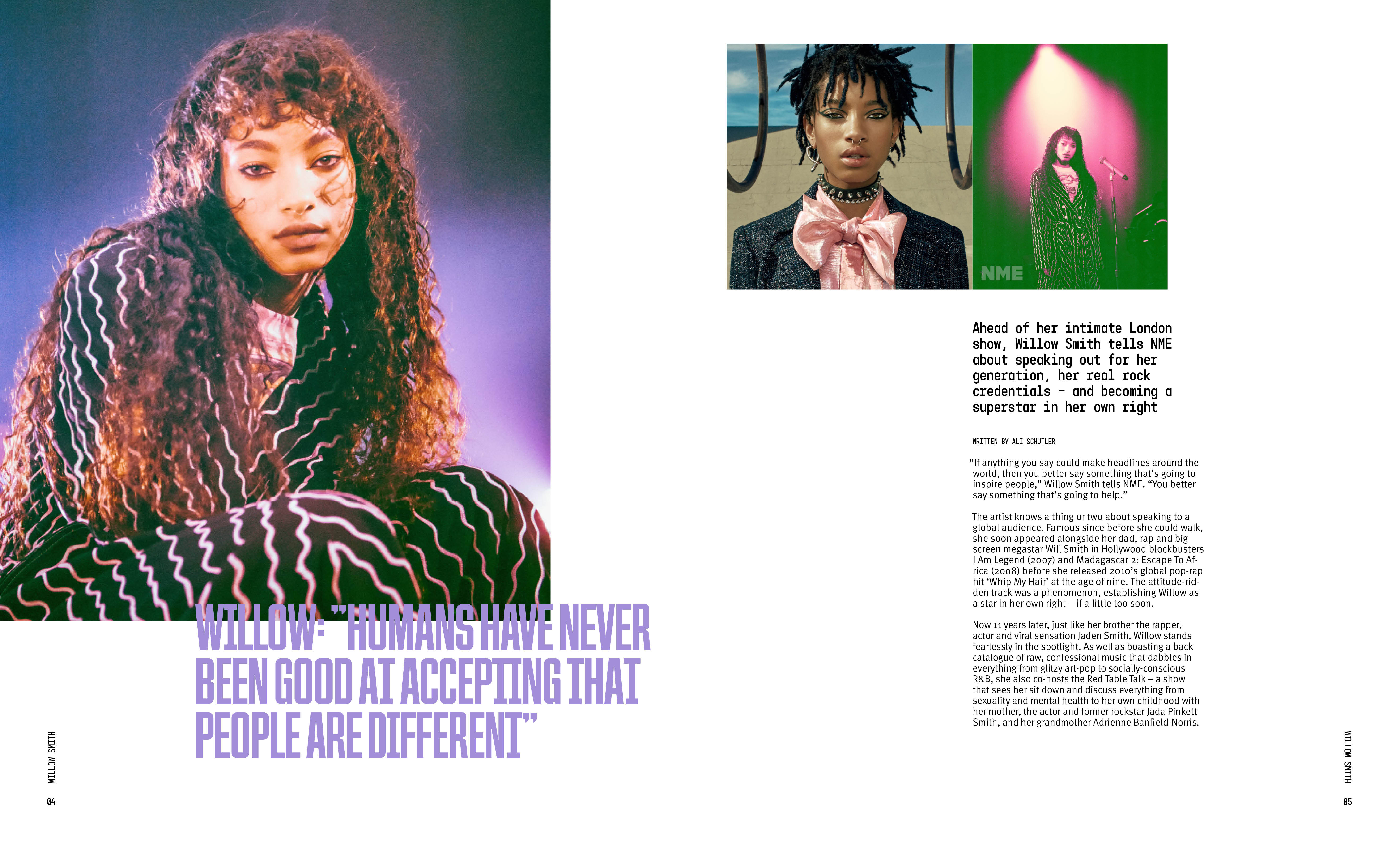
The goal for this portion of the project was to develop a cover, a table of contents, an interview article, and a feature article.
Sketches
Digital Iterations


Typeface Choices
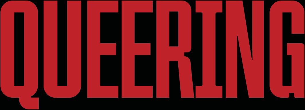
Titles: Queering
![]()
Decks and Callouts: Motor Normal
![]()
Body Copy: Meta Pro
![]()
Decks and Callouts: Motor Normal

Body Copy: Meta Pro

Final


